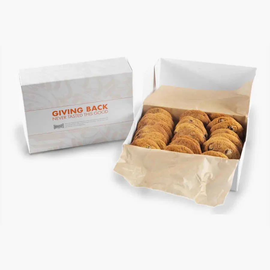
What makes a cookie box read as fancy
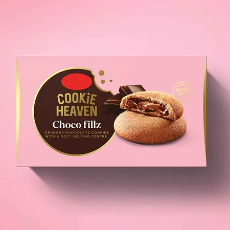
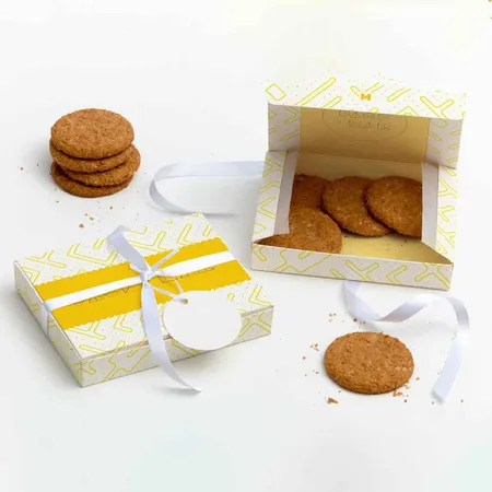
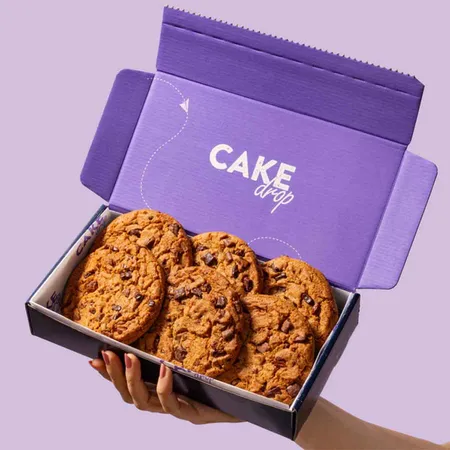
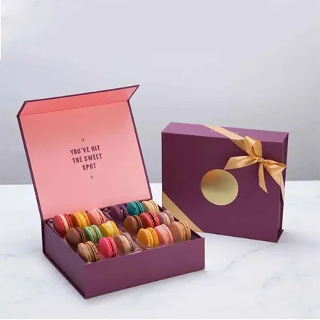
A box reads as fancy when the details are deliberate. That usually means a heavier board, a clean color field and one finish that catches the light.
Busy artwork works against you here. A single foil logo on a deep matte lid tends to feel more expensive than a full wrap of pattern.
Most buyers of these boxes sell decorated sugar cookies, gift sets or corporate orders. The box has to justify a higher price on the shelf or at the door.
Color choice matters as much as finish. Deep navy, black, forest green and cream all give foil a strong contrast. Pale pastels can work too, but pair them with a darker foil so the logo does not disappear.